TEXAS CONTEMPORARY
ART MARKET PRODUCTIONS
BRAND DEVELOPMENT
LOGO DESIGN
EXHIBITION DESIGN
ENVIRONMENTAL GRAPHIC DESIGN
PRINT LAYOUT
CURATION
__
texas contemporary is an annual fair of modern and contemporary art that celebrates the rich local art scene of Houston every fall. The total rebrand of the fair In 2016 was intended to provide a sophisticated backdrop to the dynamic and whimsical art that is exhibited there. My goal was to take inspiration from the fair's surroundings: all the way from the iconic Texas landscape down to the wacky, post-modern architecture of the venue. This inspiration lives in the brand's rich, warm palette and the gentle slopes of its geometry.
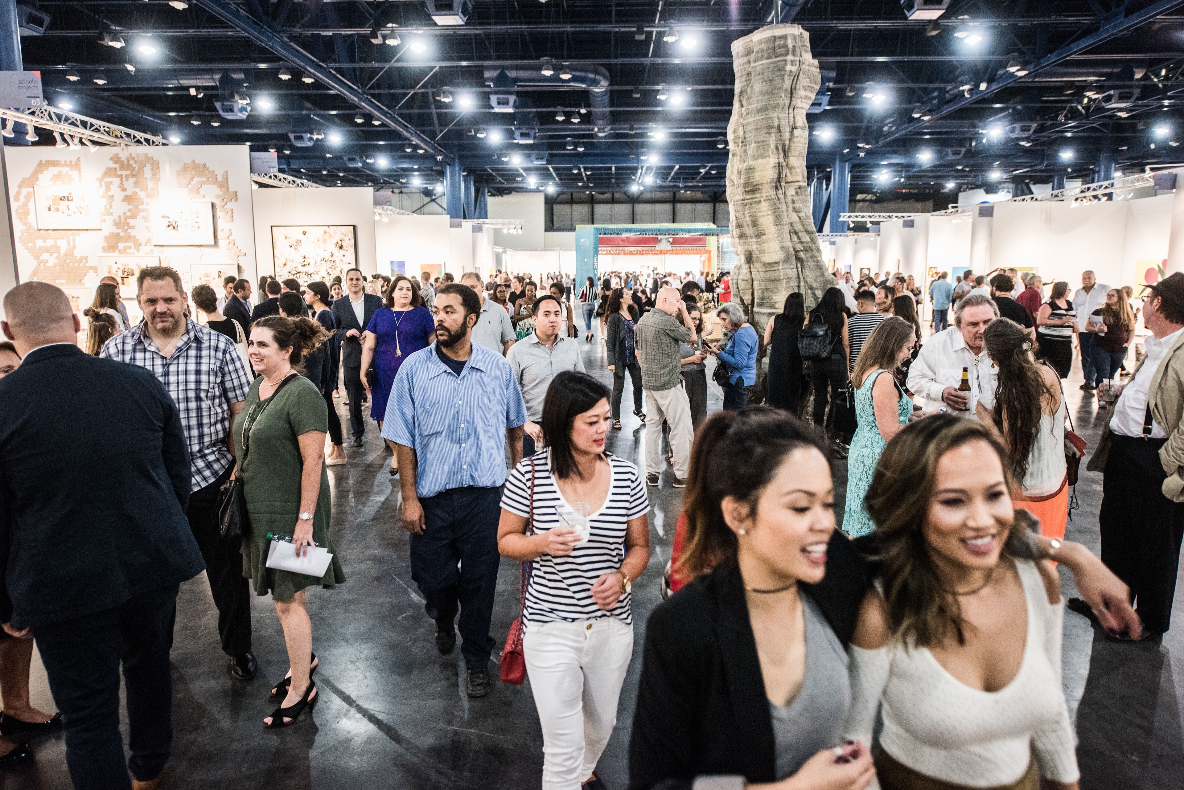
The nature of my position allowed me to design and produce this project from soup to nuts, creating everything from the branding guide to the bathroom signs. I worked side-by-side with the on-staff architect to translate the branding throughout the space, resulting in an breezy, sophisticated layout. The adage of "everything is bigger in Texas" is true here too--an enormous center aisle gives sight lines to the huge VIP structure (codeveloped with Gensler). I also curated and coordinated many of the oversized installations in the fair, allowing me to fulfill my vision of playful artworks juxtaposed against the elegant visual language of the brand.
PRESS: PAPER CITY / HOUSTONIA / MODERN LUXURY / TEXAS MONTHLY / CULTUREMAP / HOUSTON PRESS / ARTS+CULTURE TX / HOUSTON CHRONICLE
The old logo is on the left. I wanted it to feel more delicate and sophisticated but not deviate too far from the former logo and the logos of the other Art Market fairs, so I used the same typeface but in a different weight.
New logo workups for a variety of uses.
I developed a strong, sophisticated palette that is eye-catching and easy to work with.
Cohesive geometric themes keep the branding feeling consistent.
We also applied thee principles to the physical design of the fair and the curation and placement of installations.
Design elements and colors are inspired by local surroundings, from the Memphis-esque venue to Texas iconography.
Ad templates allow for the use of various exhibitor artwork, allowing the branding to grow each year.
We give our exhibitors a lot of digital assets for self promotion. These are custom emails for the fair's VIP program.
Selected pages from an interactive digital marketing packet.
These fairs require a lot of maps. I source GIS data for these so they are all extremely accurate.
This is a map we used to email visitors about where to park.
I also designed the landing page of the website which featured photos of exhibitor artwork.
These oversized ceramic sculptures by Jun Kaneko were part of an installation I curated.
Double-sided XL promotional flyers, printed on newsprint.
VIP mailer card with attached scannable vip pass. These were mailed to VIPs in glassine envelopes.
Two-page spread advertisement.
Gallery desk cards for exhibitor promotion. This features artwork by Damien Hirst. The cropping on the backside is my favorite part.
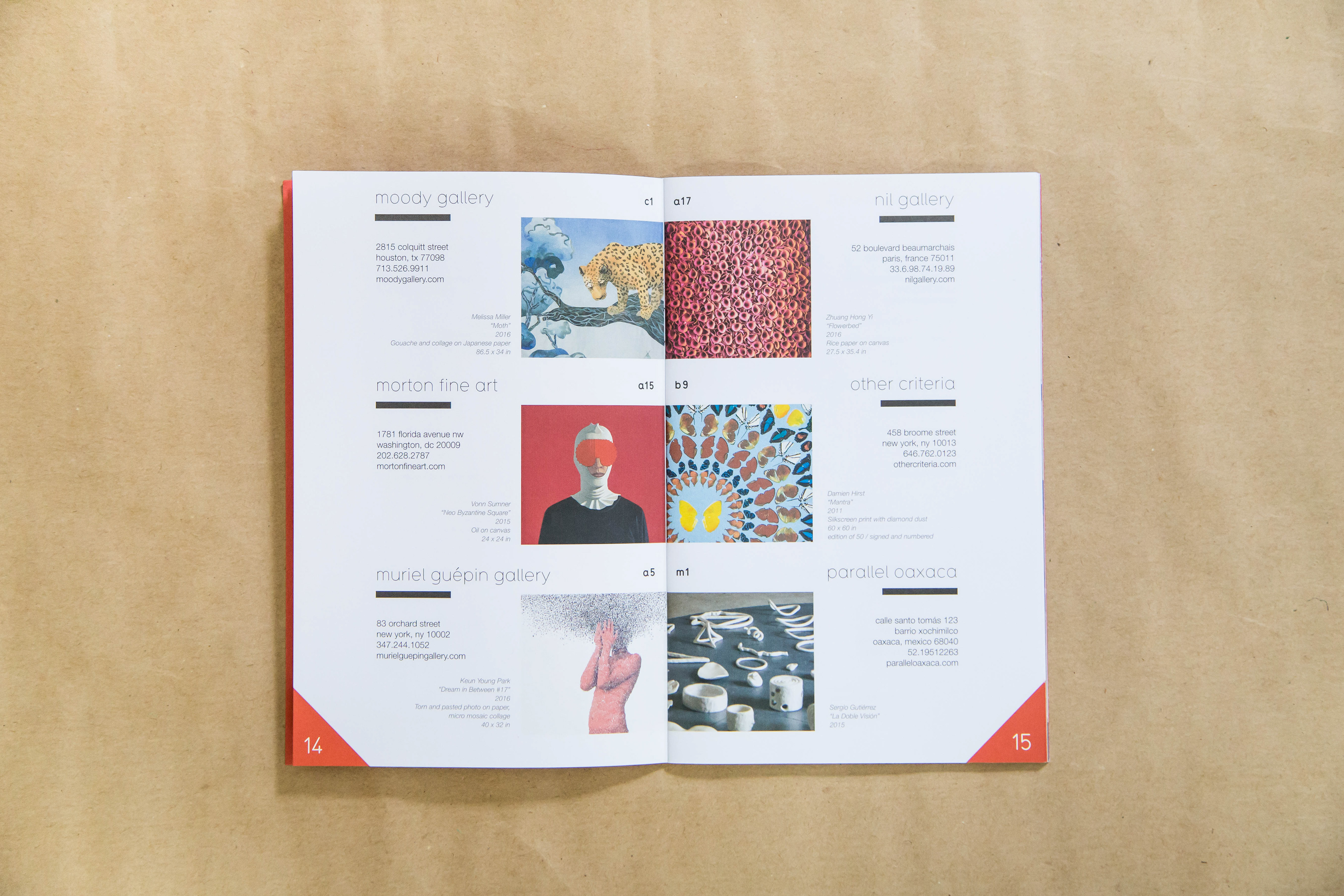
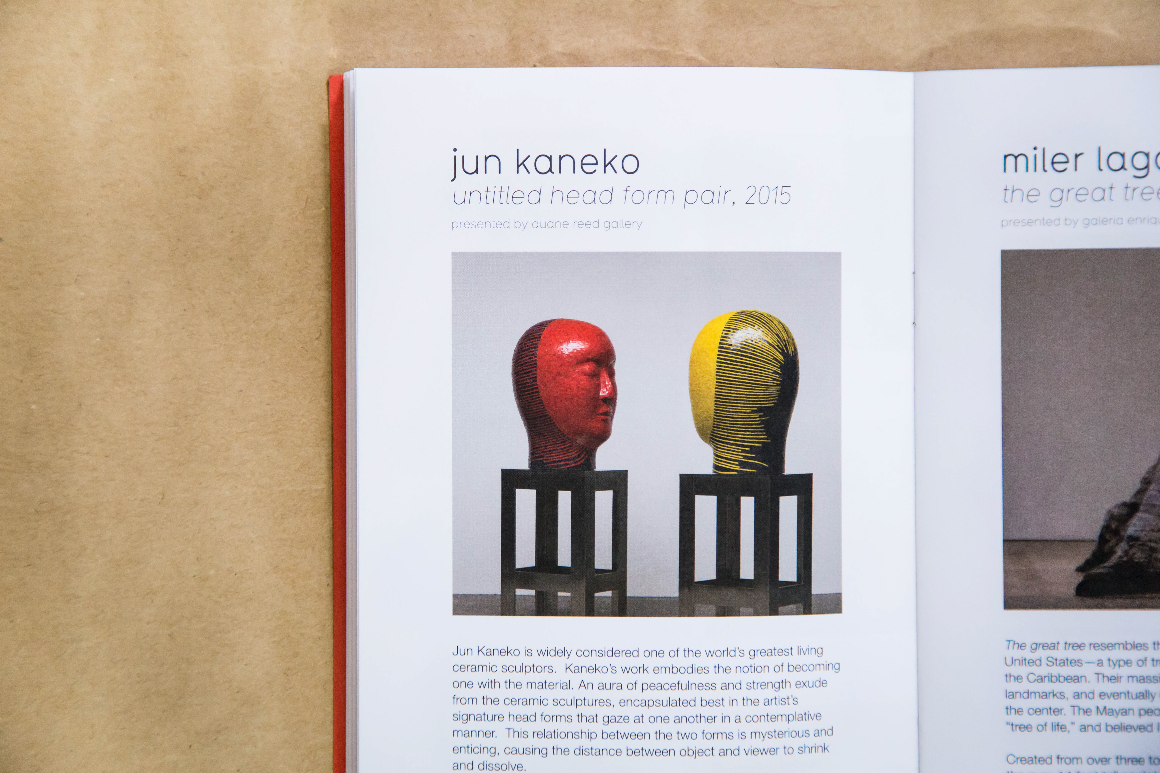
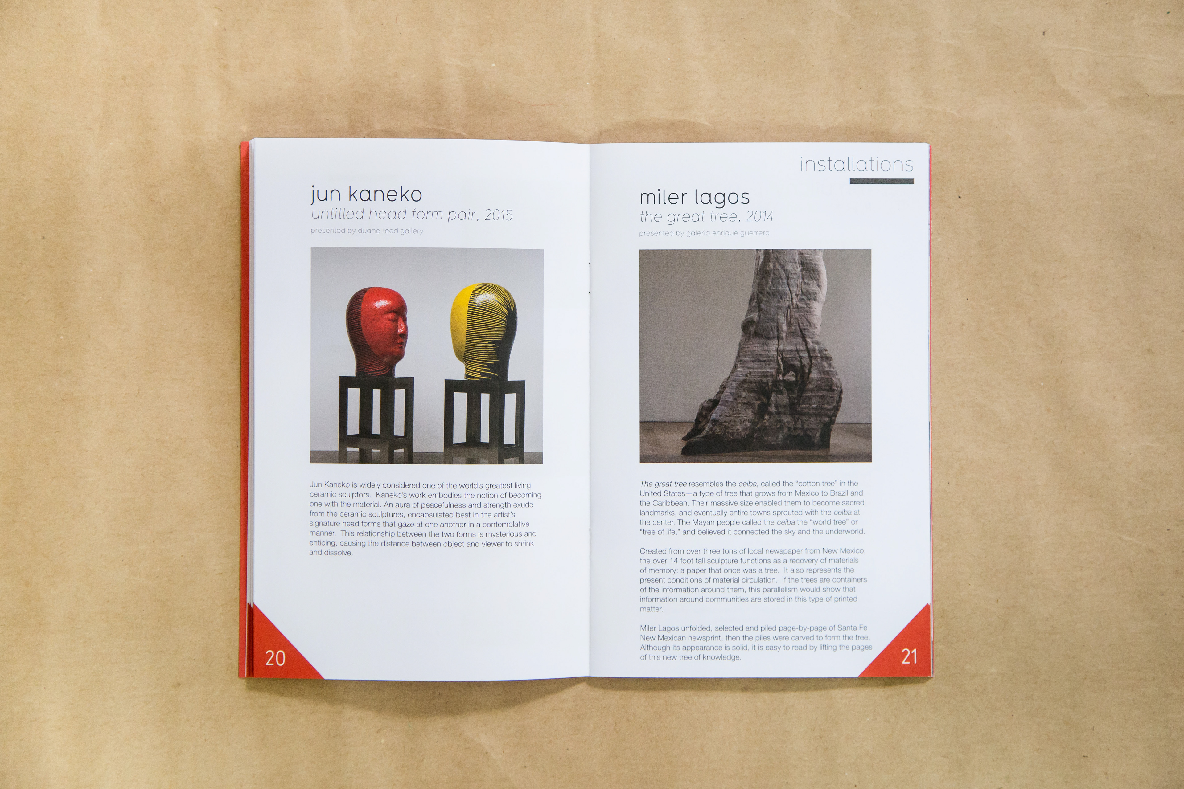
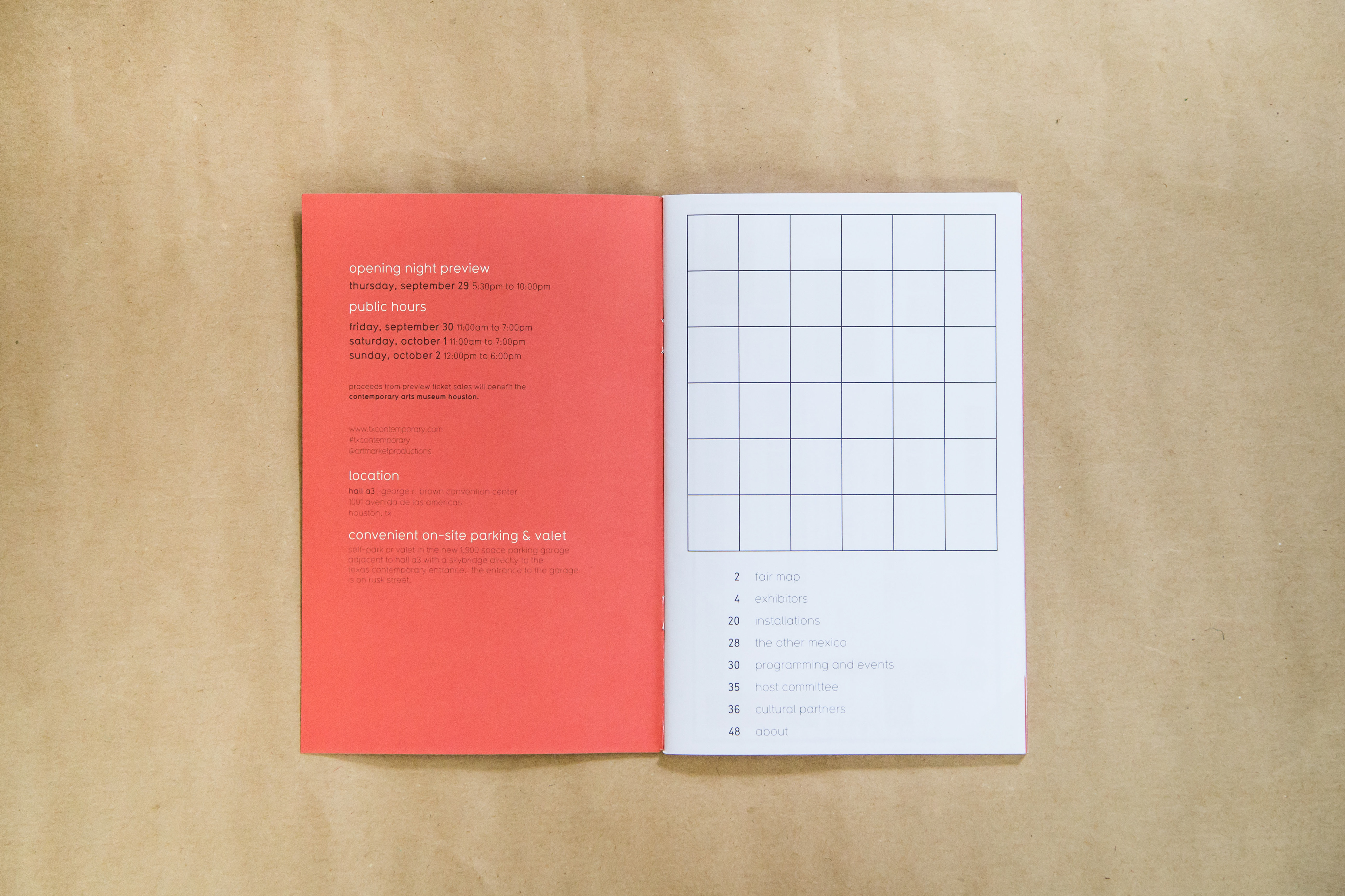
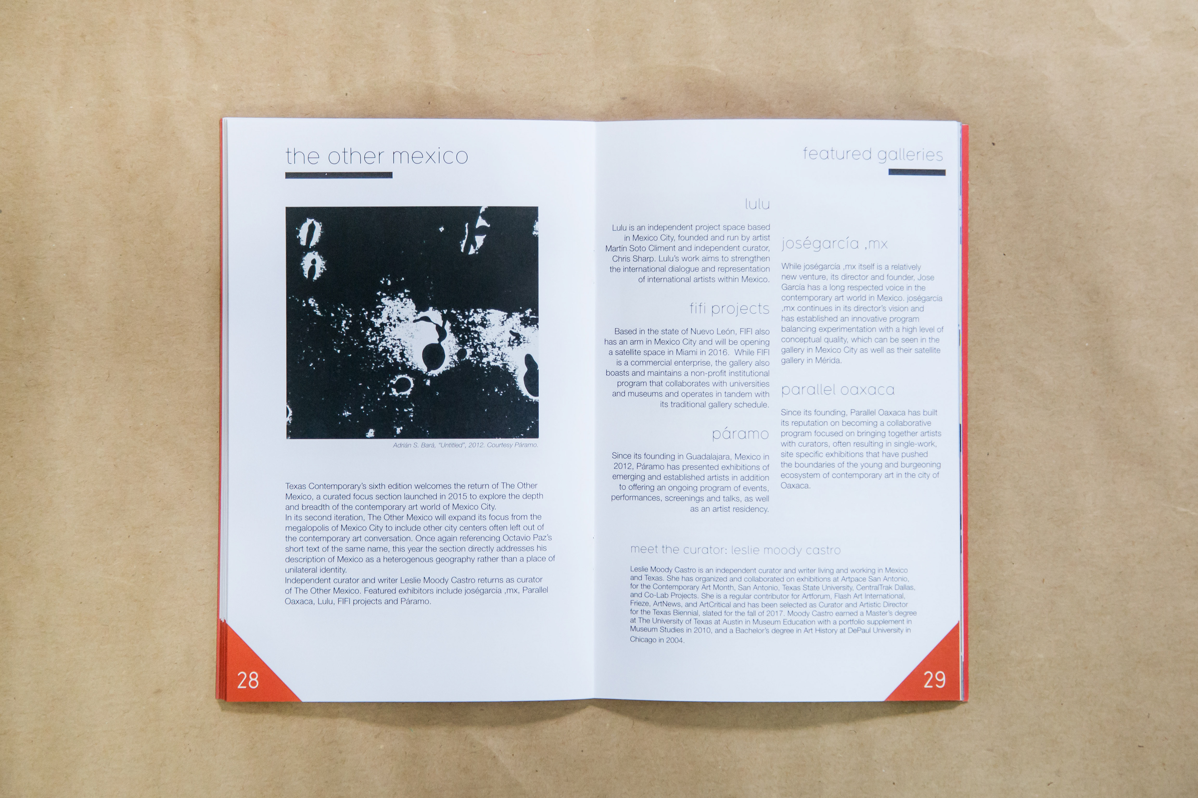
Interiors of the fair's guidebook.
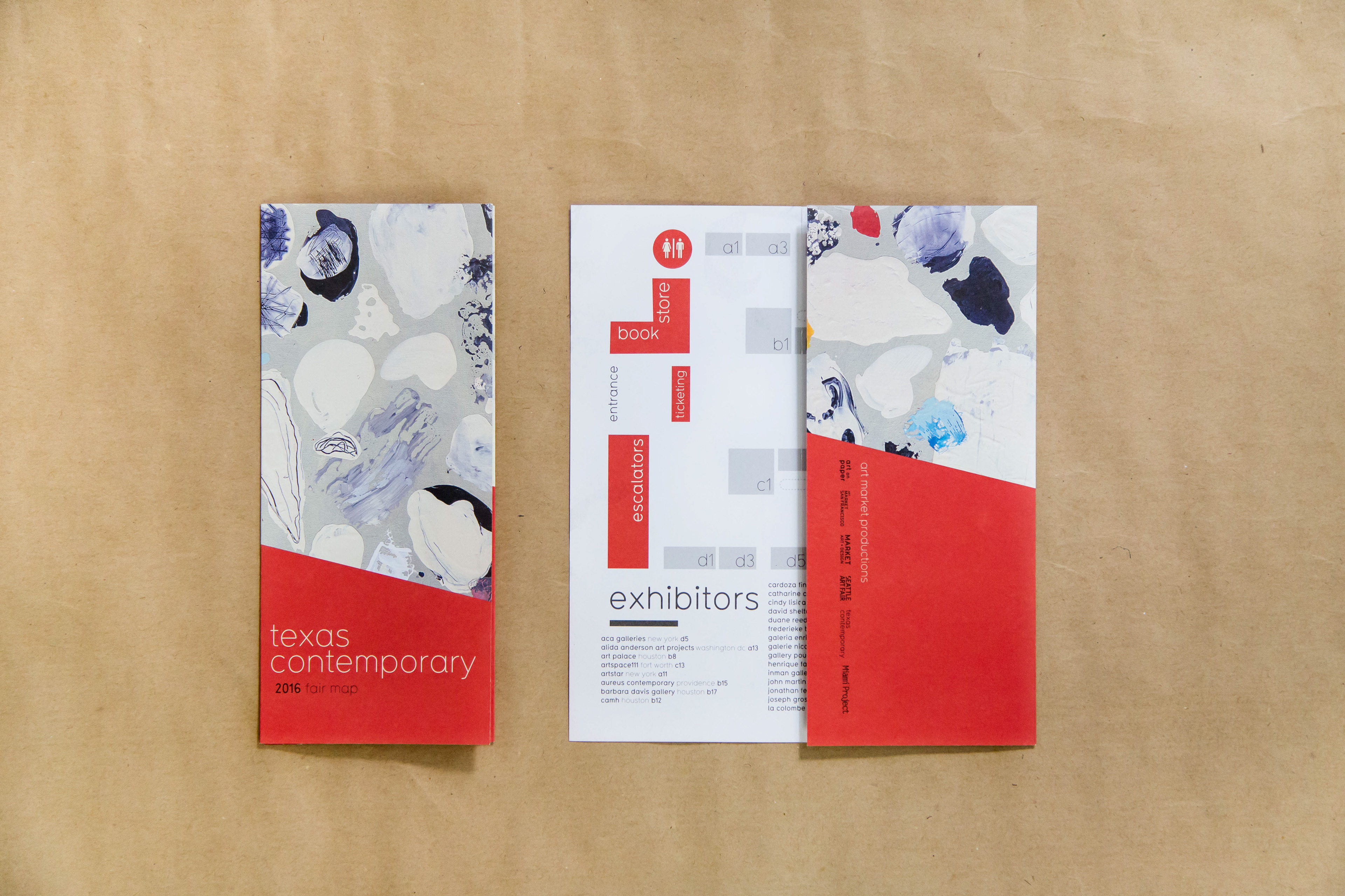
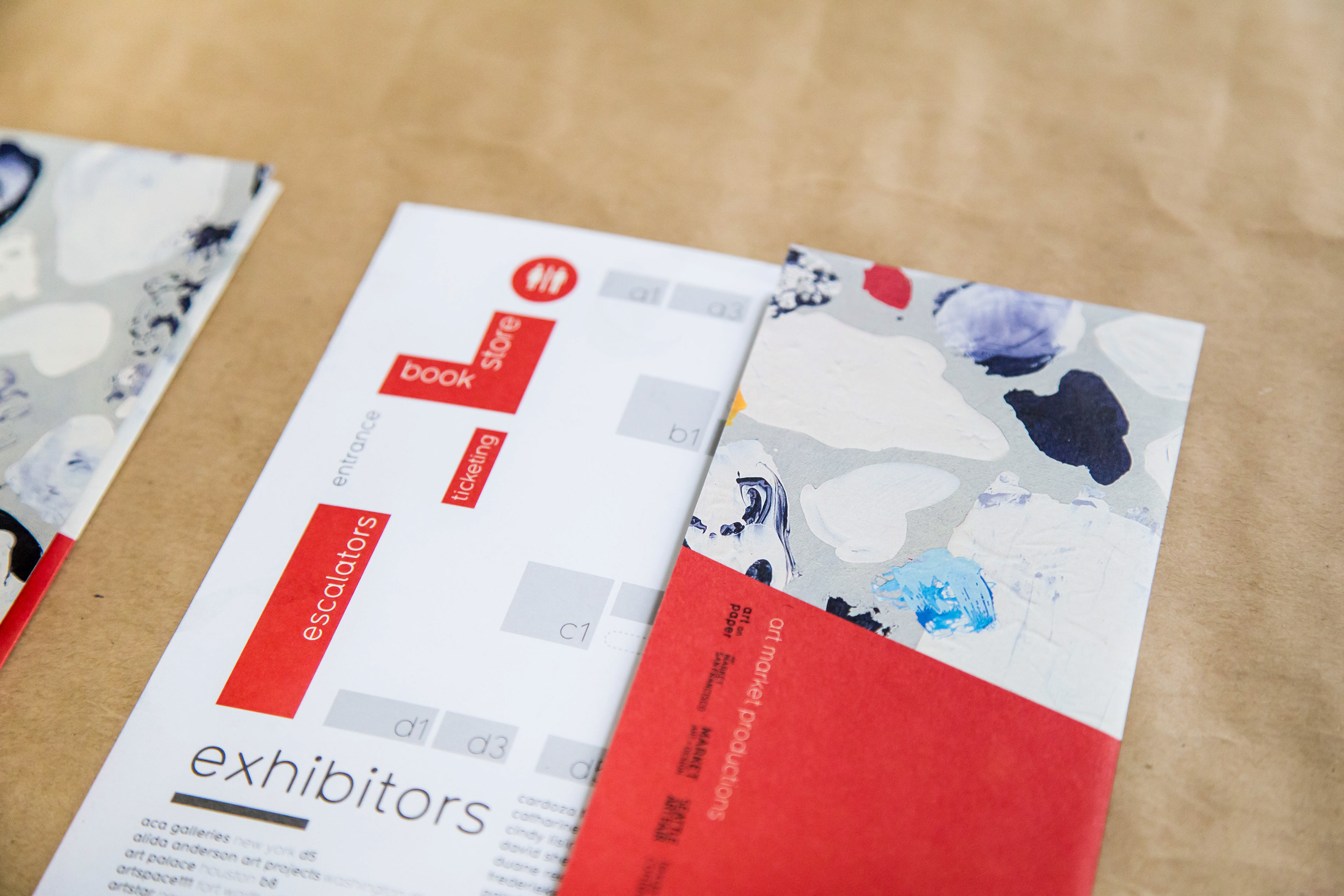
Trifold fair map. These used to be printed on glossy paper, but I switched all of our paper goods to this thick, matte stock which is cost-effective, feels luxurious, and shows color beautifully.
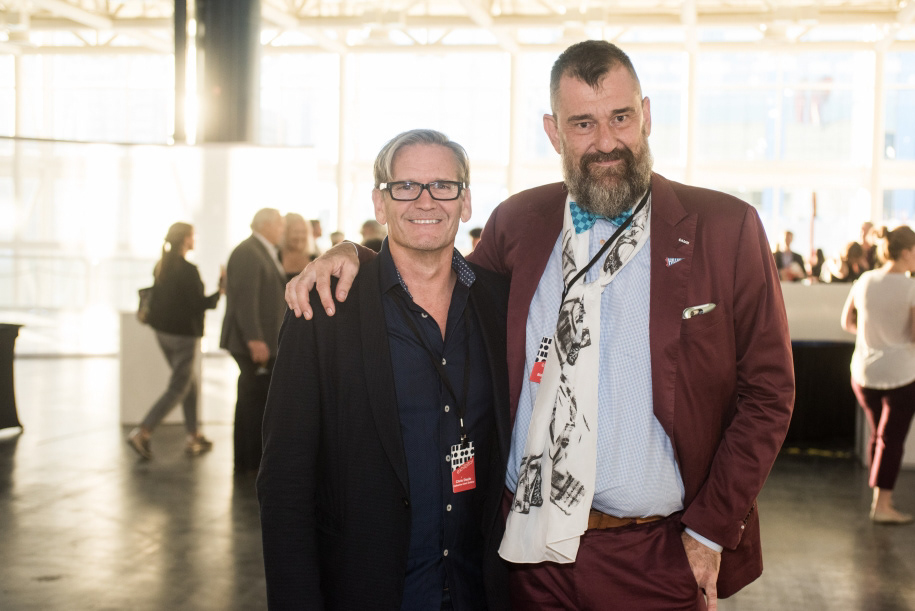
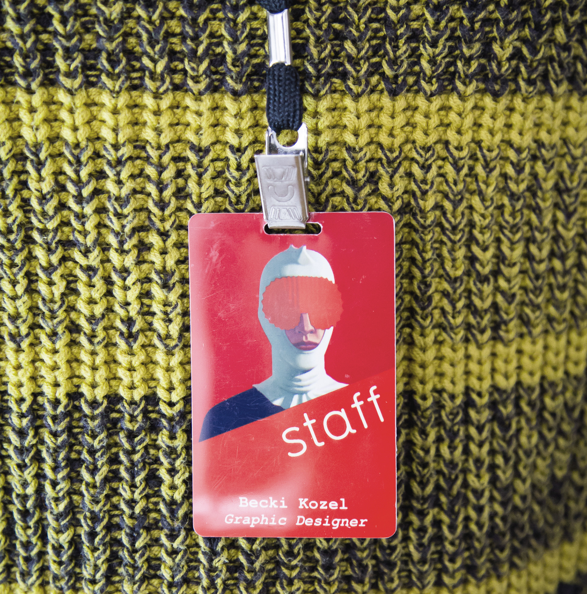
coordinating badges for exhibitors, staff, press, sponsors, and partners. The badges used art featured throughout the campaign.
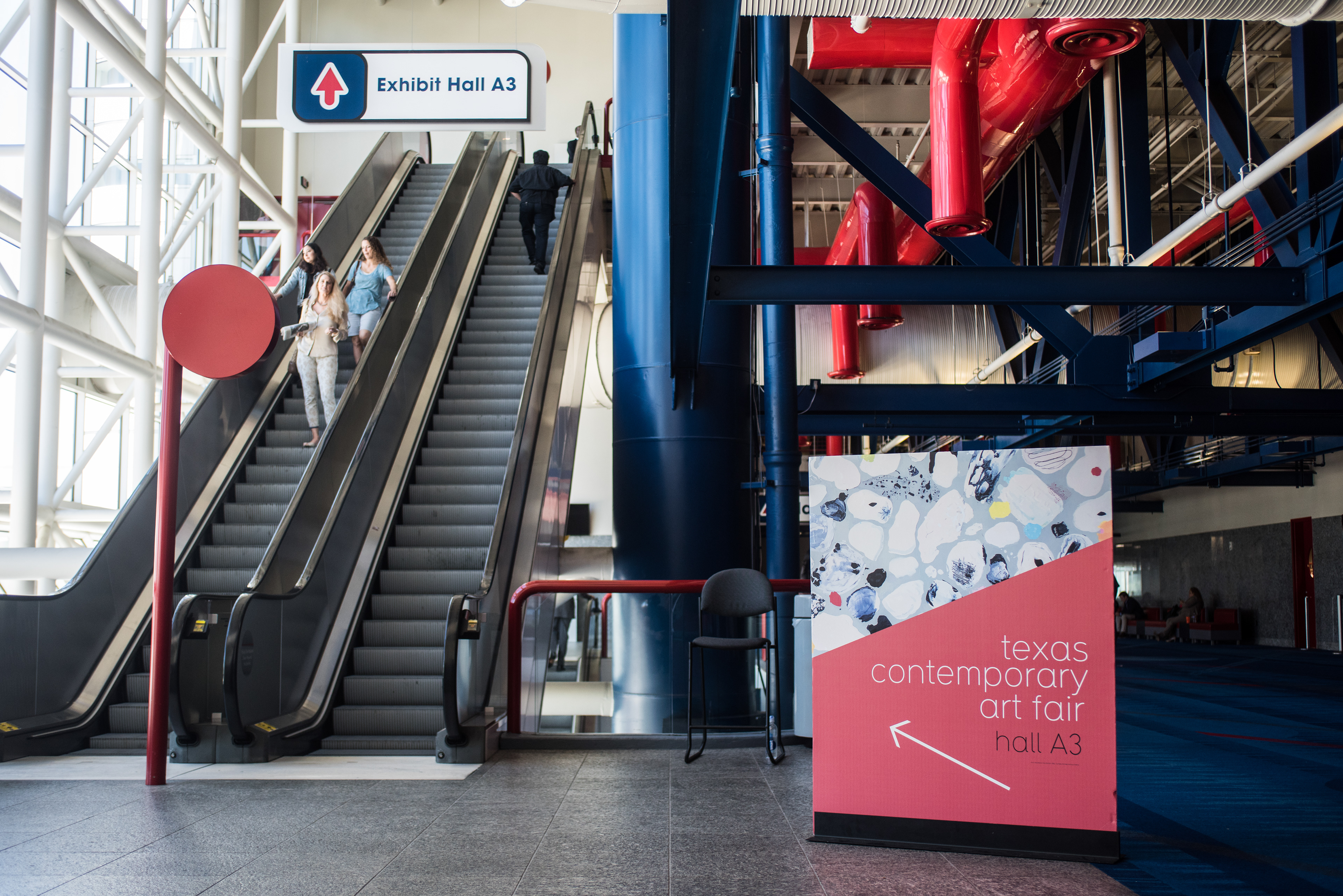
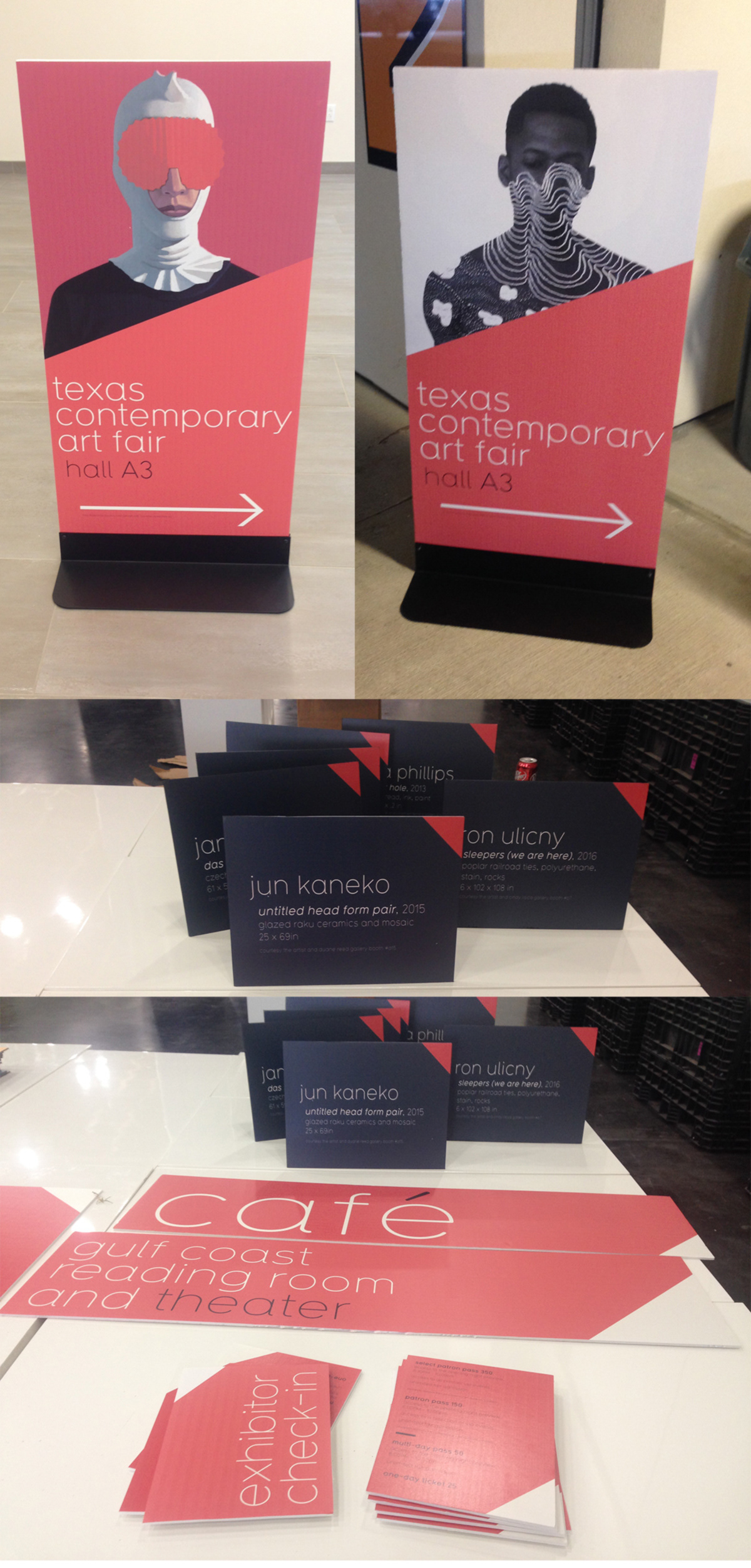
Coordinating onsite signage for wayfinding, installations, and more. The GRB is an enormous venue so an excess of signage was paramount.
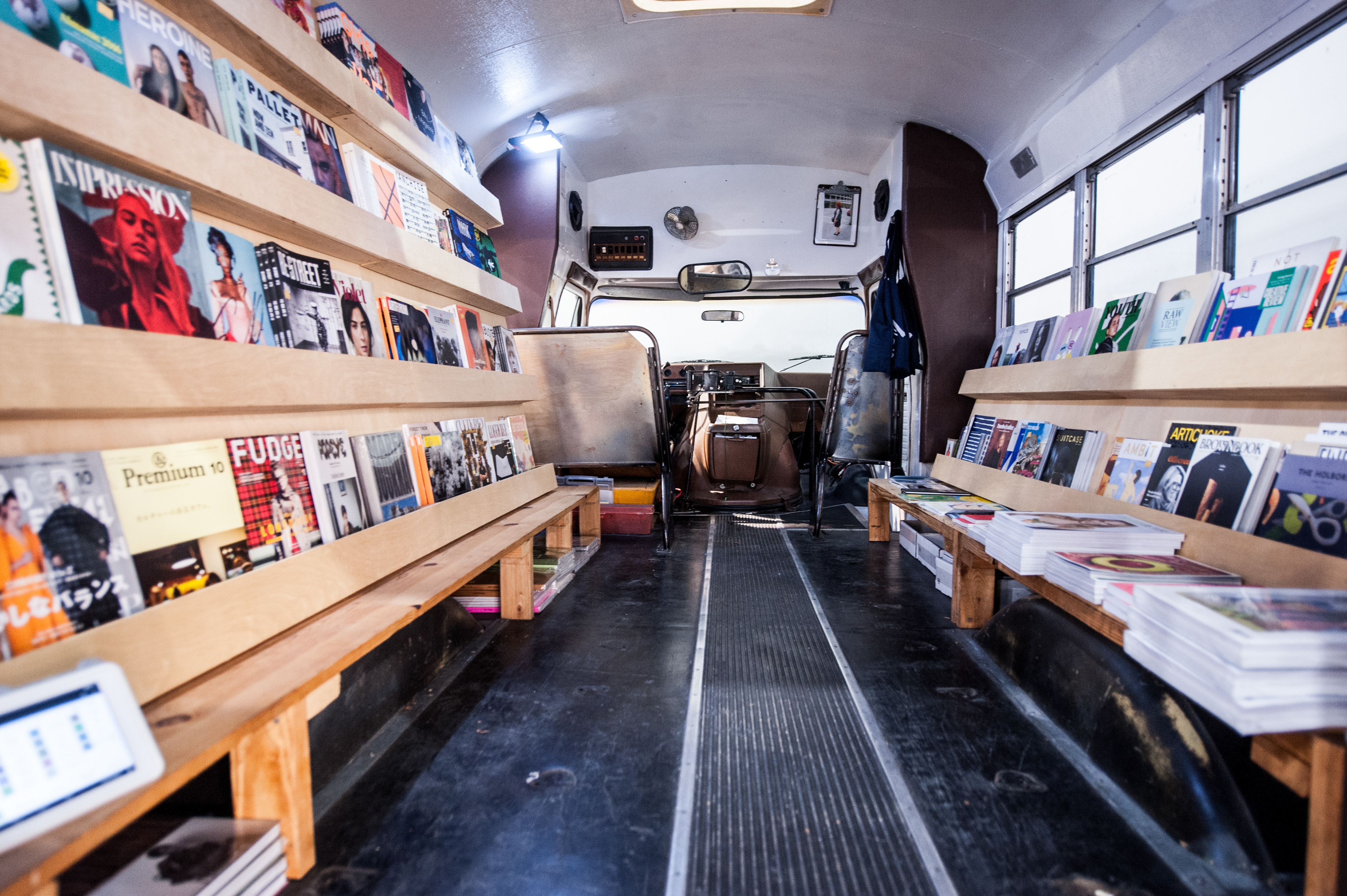
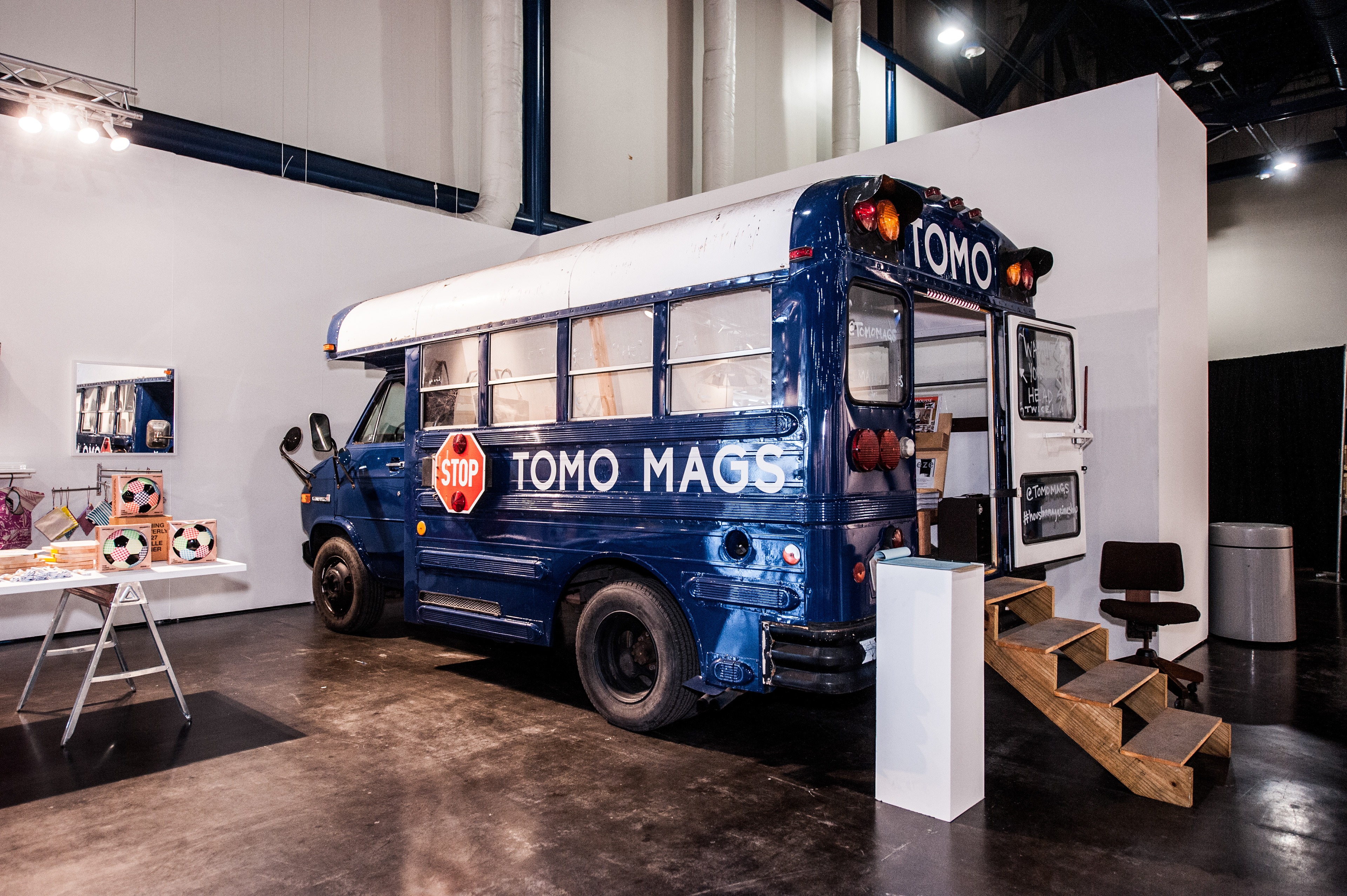
This fair always has a lot of fun interactive elements, like this tiny schoolbus/bookstore.
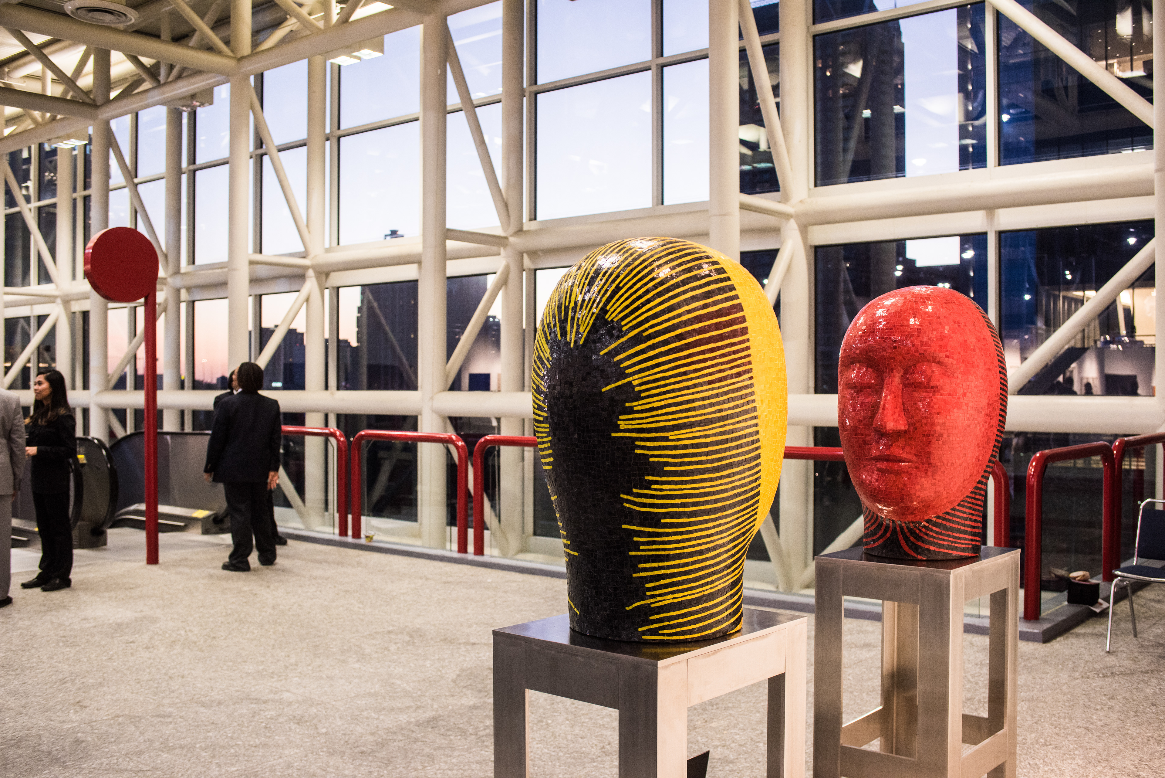
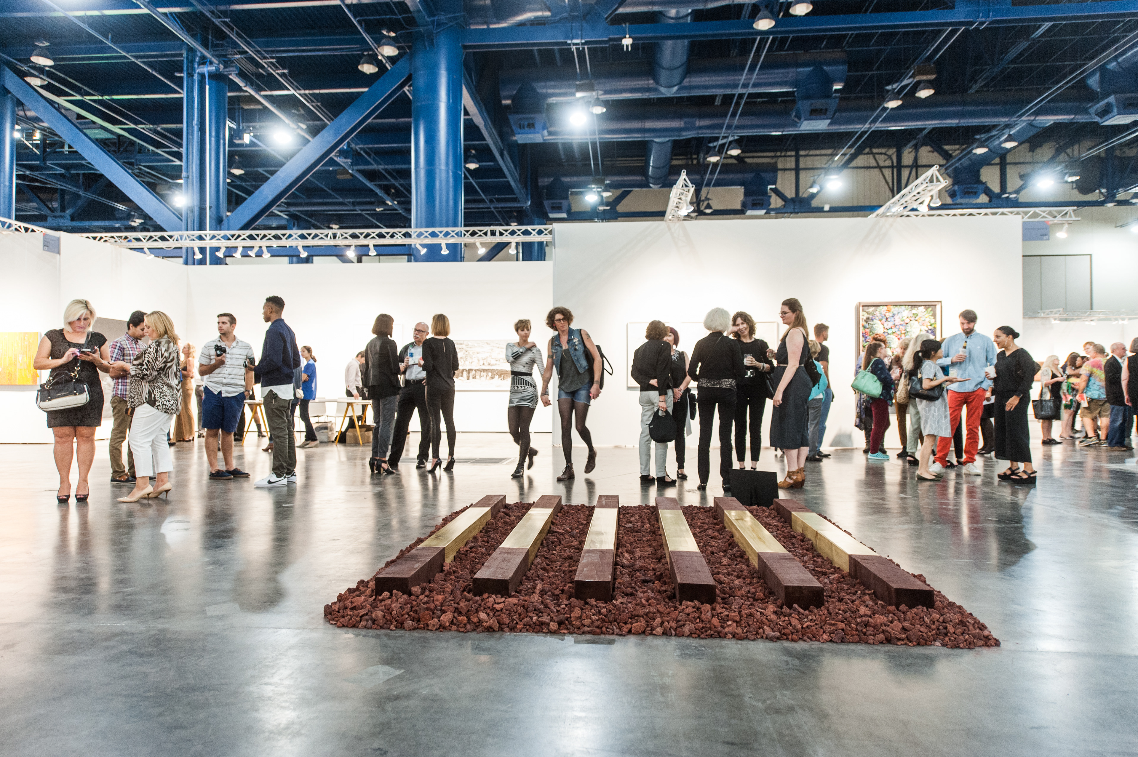
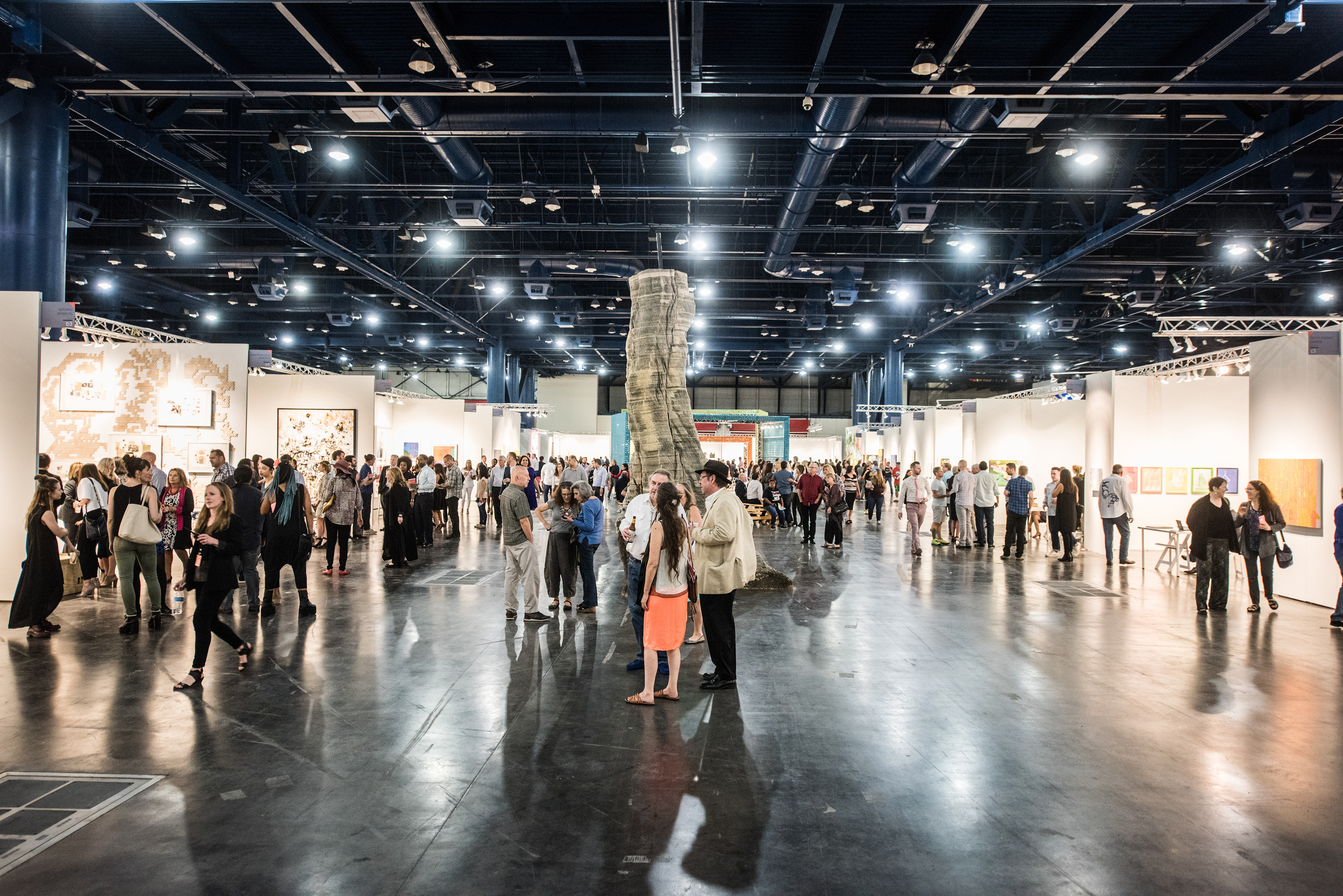
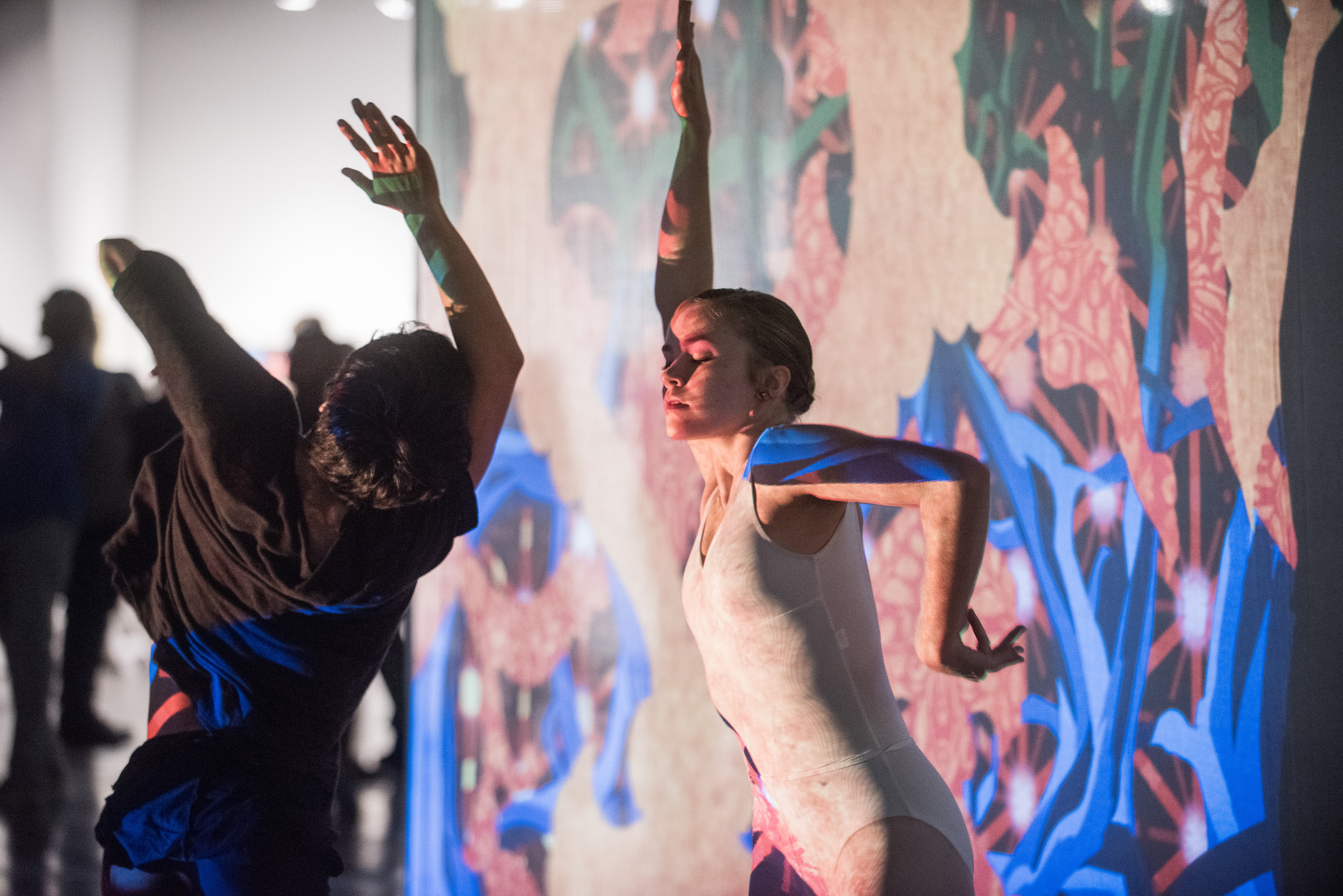
I loved doing curation for this fair, it allowed me to showcase artwork that I loved and felt was important but that I also knew would look beautiful in the branding and give an accurate representation of the spirit of texas contemporary. Jun Kaneko's oversized ceramic heads (top left) were my favorite inclusion. The wealth of space allowed us to curate without boundaries, showing Ron Ulciny's giant installation of railroad ties, Miller Lago's ten foot newspaper tree, and a dance performance by the Houston Ballet with projected art by Chris Doyle.
We collaborated with Gensler to create this modular VIP lounge, whose shape could be changed throughout the run of the fair. It was built with truss and wrapped with felt panels.
Architect: Michael Pigozzi
Production: ART MARKET PRODUCTIONS + DYNAMIC EVENTS OF DENVER
Senior Producer / Curator of Installations: Lindsey Van Nuil
Exhibitor Relations Manager: Elizabeth Anderson
PR: Nina Weissman
Fair photos by Teddy Wolff / Asset photos by Briana Balducci